

Happy Friday,
I hope this finds you in good form? Before getting onto THAT portrait of King Charles, some news...
Frank Harwood and I had a great time brandishing our brushes, for the gallery 'meet the artist' day. A steady stream of visitors seemed happy to watch, chat, and look round the latest exhibition. Frank cheekily caught me while I was painting, in this ink and watercolour wash sketch:

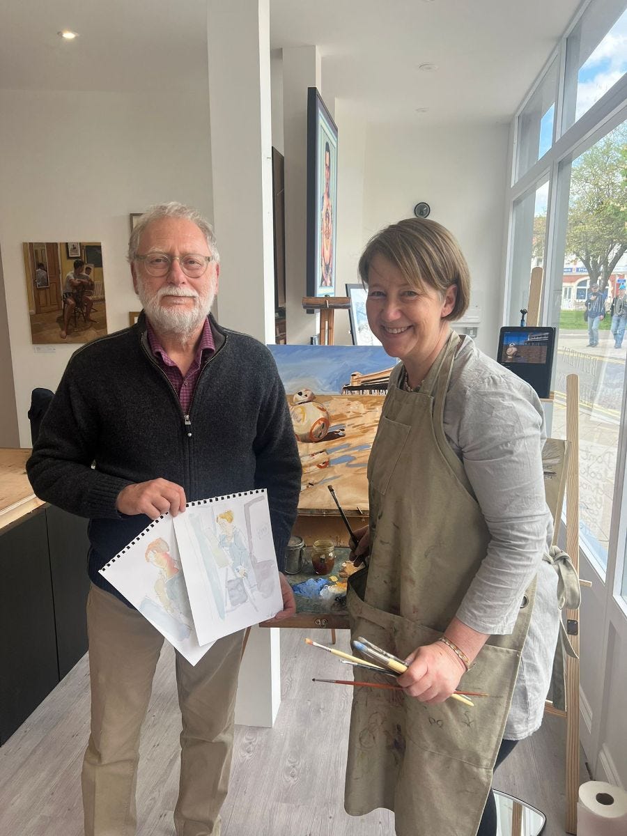
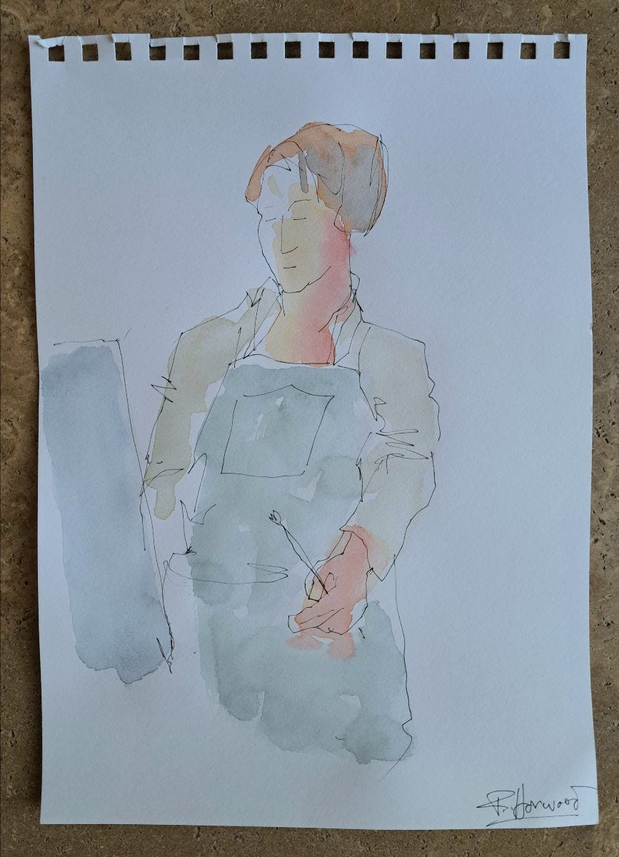
Frank captured how I stand, and feel, while painting - calmly engrossed. I love the understated observation and lack of hesitation with such uncompromising media.
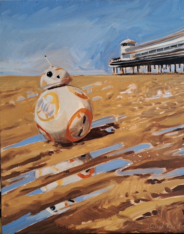
For my demo, I put BB8 in a sand tray in the gallery window, and used a backdrop reference photo taken earlier on the beach, with the Grand Pier in the background.
New Blog Alert!
Do you love reflections in art? They're fun to paint, even more so with some tricks up your sleeve...
This blog uses clear diagrams to explain the logic of reflections, and how to translate them to your artwork.
With extra ways to exploit the specific qualities of oil paints, illustrated with the BB8 demo painting process.
And a bonus tip about painting the surface of water.
Please share the blog if you know anyone learning to paint... it aims to help beginners, GCSE, art students and beyond:
Seeing green
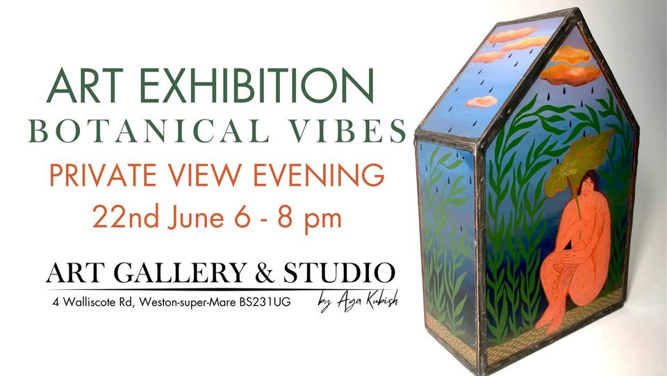
You are warmly invited to the upcoming gallery show in Weston super Mare. Featuring work by 32 artists, chosen from a really strong selection of open call submissions.
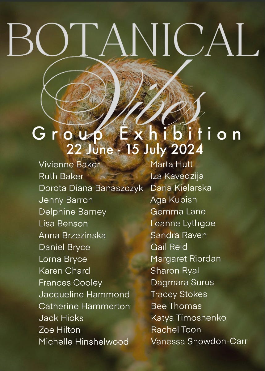
If you would like to join us at the opening Private View, click the picture below for a free ticket - hope to see you there!
Seeing red
Unless you've been hiding under a red carpet, you will be aware of the "radical" new portrait of the king, by the artist Jonathon Yeo.
The reception has ranged from scathing to gushing (to be honest I haven't been able to find much credible gushing. There's Hello magazine. And there's a link to an article in the Telegraph on Yeo's website which I assume is complimentary but it's behind a paywall).
If you want to see it in person, it's on free public view in London until 14th June.
In the artist's words
A very diplomatic response by Jamie Coreth, who knows what it's like to receive mixed reactions to a royal portrait.
Click this image for critic Katherine Tyrell’s “Making A Mark” blog review (she’s a good aggregator, knows her stuff about how to observe and render people, and knows the contemporary portraiture art world).

Guardian critic Jonathon Jones: “a cringeworthy bit of facile flattery”
I agree with Coreth, it's not nice to criticise a fellow artist's work. In that spirit I can appreciate art that doesn't resonate with me if it is brilliantly executed. Even my pet hates (male gaze & chocolate box) can still uplift on a technical level.
But here's my take -
Yeo's portrait resonates with me in several ways - I like the red, and how it clashes with the flesh tones. The butterfly is a nice metaphor, not very original (but it was Charles' idea, and to his credit Yeo said he was trying to coax a reference to environmental interests). I love the scale (inherent in the specification). The fact it's caused such controversy is a sign it's remarkable, even bold. Nobody could accuse Yeo of playing it safe. Artists are generally advised to develop a distinctive visual language, which Yeo has, and the style is consistent with the rest of his output.
I have only one complaint. If you're doing realism (as this is), then figures should be constructed convincingly. They may be idiosyncratically distorted (eg Egon Schiele, Paula Rego), to great effect. But there's a difference between distortion from a basis of accuracy, and using textural noise to downplay unresolved anatomy. I can see why Tyrell queries whether Yeo has done much life drawing.
A fun way to check this is to imagine disrobing the figure. It's subtle, but when you try and visualise the living breathing body underneath, anomalies are more apparent. The arms don't look quite right to me, the overall posture seems wooden, missing those subtle nods to underlying anatomy.
If an artist uses photography, or scans/casts from life, it doesn't matter whether they understand bone structure - it's covered by the method. However, professionals who freehand render realistic figures in their work use anatomy and proportions to communicate physical presence, gesture, weight, gait... even good comics and graphic novels do this very economically and convincingly.
In the BBC video above, you can see a collage of reference photos, demonstrating Charles' physique and posture under the uniform.
Applied anatomy takes sustained really hard work - intensive mindful study and/or practice from life. It doesn't preclude creativity, it underpins it with quality. Very few artists now have the luxury of atelier training or apprenticeships with écorché models. But we have ample free online resources. Just like reflections on water that jar if they're structurally unconvincing, it is a false economy to fudge it.
What do you think? Sour grapes? It's true I'd love a pop at something like that!
Amit Ghose's portrait is finished and framed, ready to be hung in City Hall on Tuesday. I will that to share with you next week.
If you follow me on Instagram you'll have seen progress videos like this one where, co-incidentally, I was struggling to get the anatomy right. Nobody said it was easy!
Thank you for reading, wishing you a safe and peaceful week.
Gail xxx